Youi
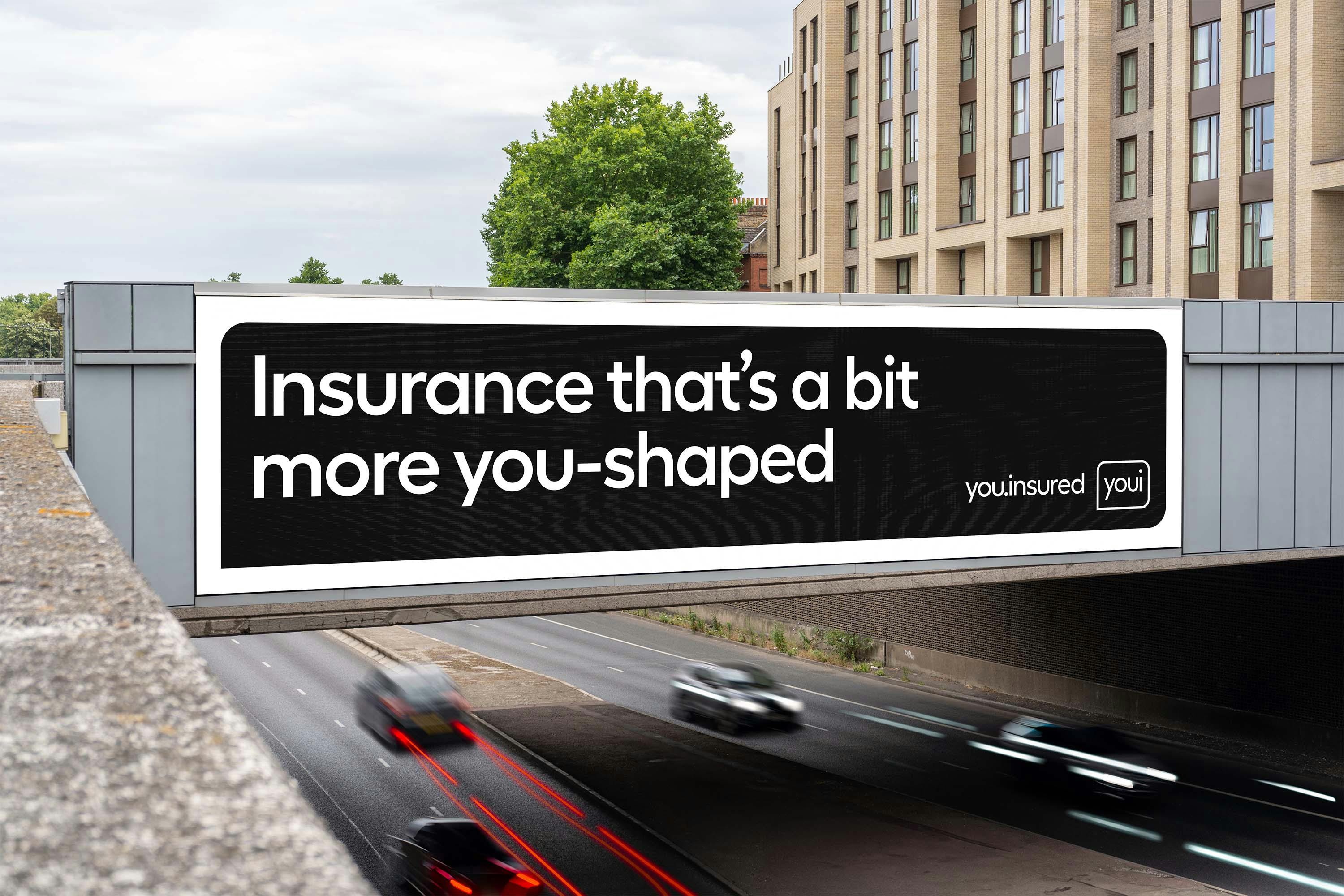
What if insurance was a little more you-shaped?
When Youi launched in 2007, they didn’t set out to be just another insurer. In a category full of corporate speak, they were real and on people’s level. Putting customers first set Youi apart, and it’s stayed at the heart of the business ever since.
As Youi continues to grow and become the trusted go-to for more and more Australians, we were brought on board to ensure their customer-first mentality was communicated simply and authentically through every aspect of the brand.
Services:
Brand strategy, identity, sonic design, art direction, typography design

A focus on you
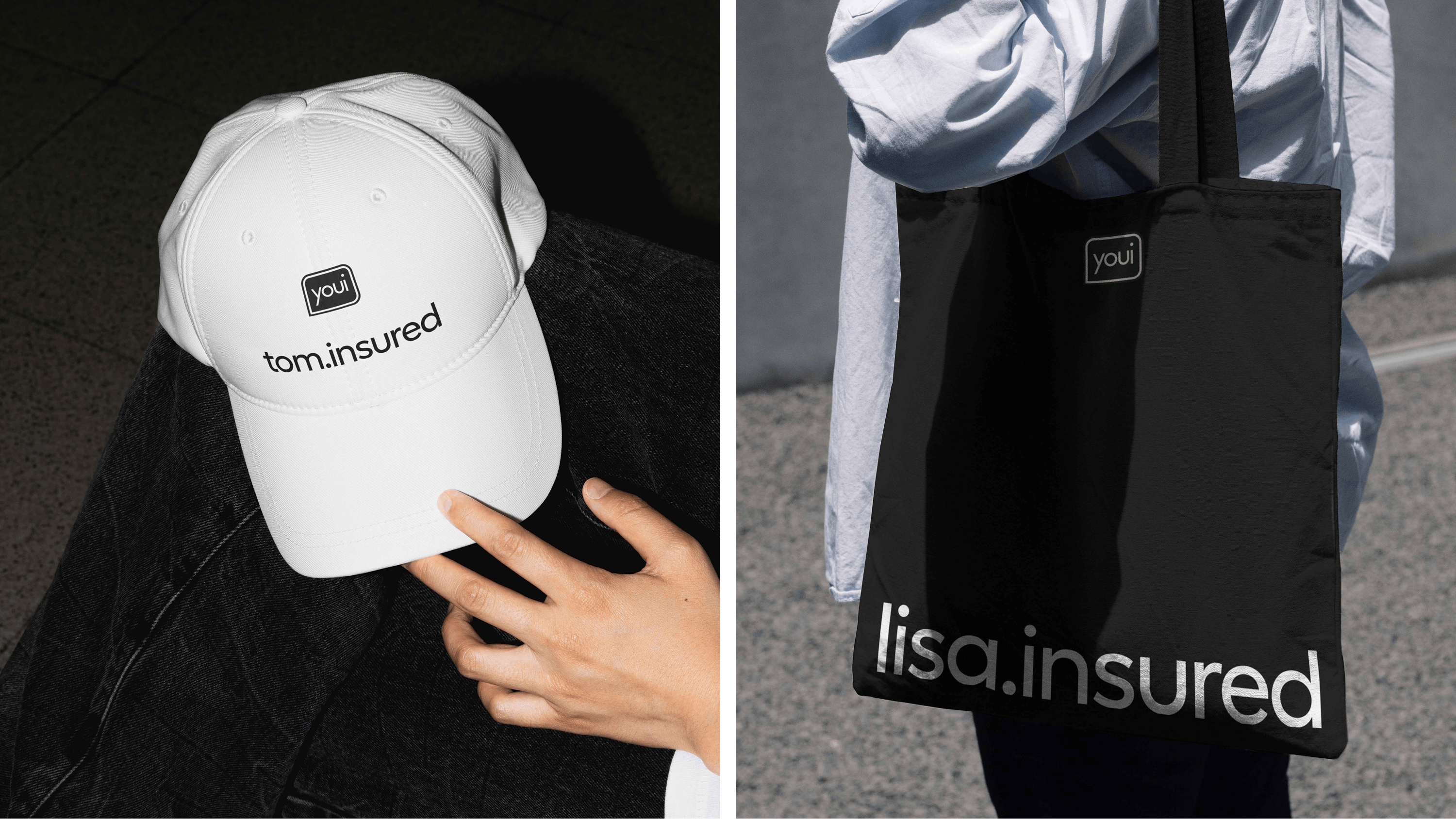
There's nothing abstract about it—you are at the centre of Youi. The logo becomes a lens device, a way to put every customer in focus.
This idea enabled us to reimagine an existing asset in a new way. It’s no longer just a logo, it informs the entire brand system—holding typography, photography, and helping bring attention to different elements. It’s dynamic, responsive, and constantly adapting. Just like Youi, it’s built around you and your needs.
In an insurance world that can often feel overwhelming, the system keeps things simple, helping organise product and price info in a way that’s easy to understand.

Real people
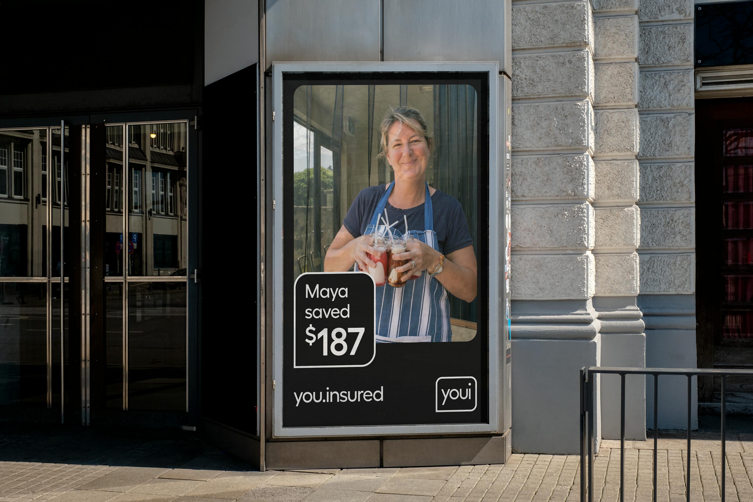
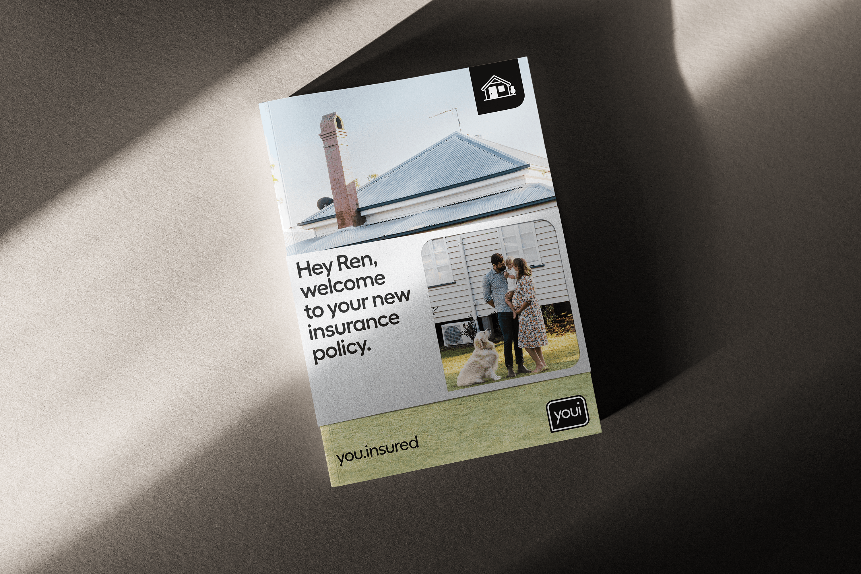
With Youi’s pared-back, black-and-white identity, photography plays a vital role in storytelling—bringing warmth and vibrancy to the brand. Subjects are depicted in candid moments—not staged or posed, but showing real people in their everyday world. Warmed by natural sunlight and featuring a true cross section of modern Australia, this is a brand that’s designed to connect with everyone.


Youi sans
Youi's typeface needed to capture its distinct personality while also being accessible and easy to use. Type foundry Displaay was engaged to create a custom version of Youi’s existing Fellix typeface that adds quirks to select letters—like a characterful kick on the Q and R, and rounded lowercase letters to match the wordmark.
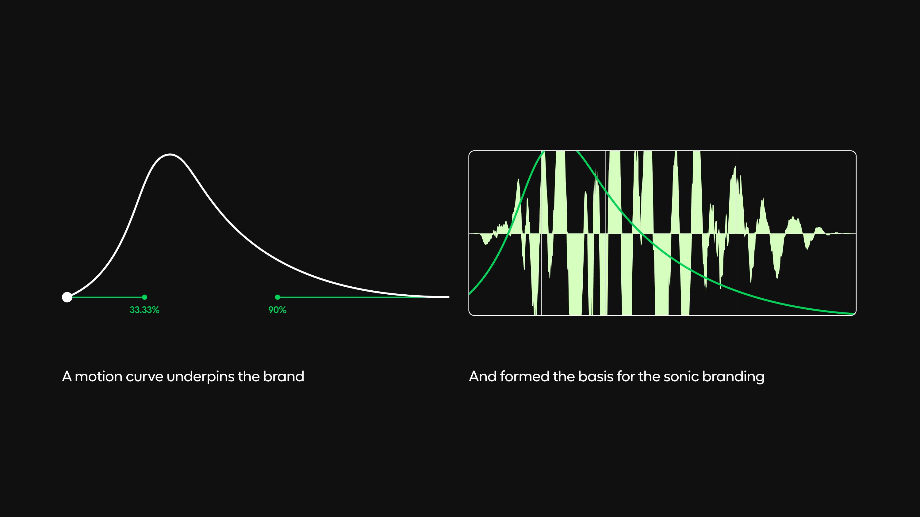
Personality in motion
A unique, non-linear motion curve underpins all movement in the brand, from how the lens device appears to the way the logo, photography, and typography animate. The curve gives us a sense of a brand that’s fluid, dynamic, and genuine. It gives Youi a motion language that doesn’t feel uniform, but full of genuine character—just like their customers.
What does that ‘sound’ like?
We teamed up with specialist sonic branding agency Resonance to bring Youi to life through sound. By matching the sonic logo to the non-linear motion curve, the way the brand moves and sounds are perfectly in sync.
The brand anthem builds on this, layering elements that match Youi’s conversational tone. The symphony comes to life with live musicians, rhythmic call-and-response, hand-claps, clicks, and vocals — all adding warmth and a distinctly human feel. It creates a deeply human sonic world that cuts through the category noise.
"Lorem ipsum dolor sit amet, consectetur adipiscing elit, sed do eiusmod tempor incididunt ut labore et dolore magna aliqua."
xxxx
Credits
Sonic branding
Resonance
Typography
Displaay Foundry